
However, I also paint ideas, which has been a good thing for this period of time. Why? When I paint with spontaneity, in the problem solving mode, the 2-month long painting (such as the one I'm writing about today) would find me confused every time I got to the studio to paint. I would waste precious time trying to get back into the painting, trying to figure out where it was going.
This latest painting was definitely inspired by ideas, both in its content and execution. I took a fresh start on a similar painting that recently sold. I had a few ideas of how to execute the same subject matter in a different way.
 Step one (which was many steps) : In the previous painting I used black gouache to create a dark and dramatic background. In this painting, I wanted to create a dark background using transparent washes, rather than an opaque black, so I consulted with a couple of painting pals who do this sort of thing on a regular basis. I used clear contact paper to cover all the area I wanted to remain white and used frisket/mask to protect the edges because color will seep under the contact paper. I then proceeded to make a very heavily pigmented wash of very transparent watercolors to apply with a sponge. I used mostly blues, but some red, yellow and green in other layers to get a more interesting depth of color. I must have repeated this process 8 to 10 times over as many days since the paper must be completely dry to put on the next wash.
The things I learned in this process:
- The repeated wetting of the paper creates a lot of buckling on 140 lb Arches paper. I'm not a fan of stretching and stapling paper, so I would use 300 lb. next time. After several sessions, I began to place the damp sheet of paper under weight to flatten it for the next round.
- Some paints pick up each time you apply the next coat, so I consulted with another friend to get recommendations for a better paint choice.
- My very last application was done with a mouth atomizer, which really made the most consistant covering of the dark.
- Rome wasn't built in a day and neither is an almost black background!
- Even with the most careful masking and protecting of the paper, there will be some seepage which will need careful lifting.
Step two: In painting the rocks under the fish, I used many different colors, mostly wet into wet, and sprinkled salt to create texture. After the salt and colors were dry, I used a credit card to remove all the crystals. Next I began a process of disguising the "gimmicky" salt look to the rocks, while leaving a very textured appearance.

What I learned:
- Be sparing with the salt and only apply it on individual rocks rather than a sprinkling.
- Apply the salt onto very damp paint.
- Let is all dry before removing the remaining salt crystals carefully with a credit card or other scraper.
- Rewet and apply more opaque paints to calm down the texturing.
Step three: Carefully place the hatching salmon eggs among the rocks.
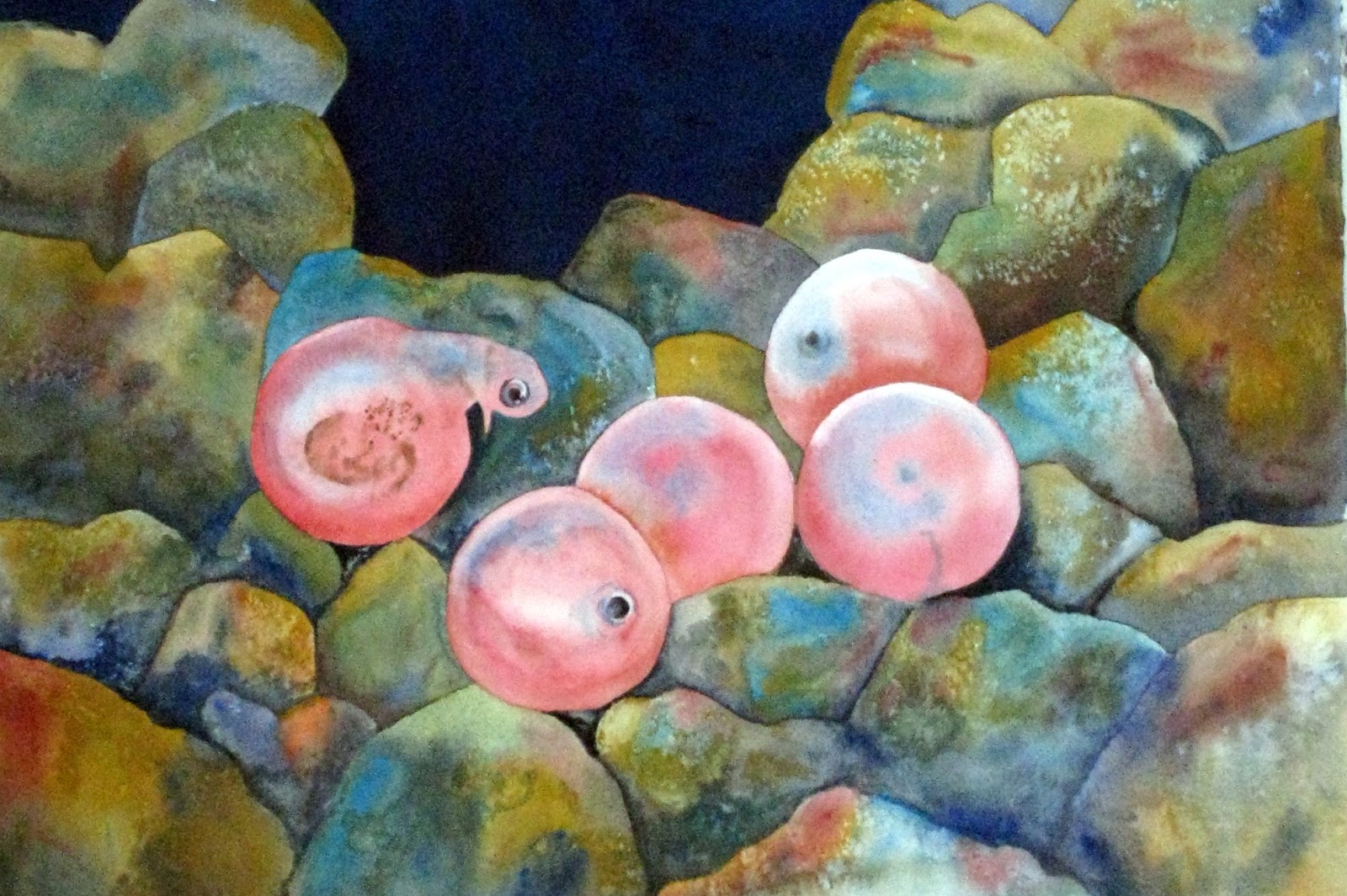
After placing the very "living" eggs among the rocks, the rocks looked "dead." I've peered over a raft often enough to know that rocks look very animated in the river with motion and reflecting light.
 What I learned:
- Using a small scrubber I could bring interest into the rocks.

Step four: Paint the group of salmon swimming through the water and over the rocks and eggs.
I had to figure out how to make the background fish recede without looking muddy or faded out.

- To tone down the colors, I started with a light blue wash, rather than washing over at the end.
- I had to add color. As the paint dried, I saw that the first application of blue toned things down more than I expected.
- To make the entire painting more color harmonious, I added more purple and violet to the rocks to repeat some of the colors that developed in the fish.
- In the end, I also came back to the eggs with more red/orange to make them pop.
And here is the finished piece. I'd love to hear what you think!
 |
| Life Cycle Imperitive #6 30 x 22 Watercolor on paper |