
 |
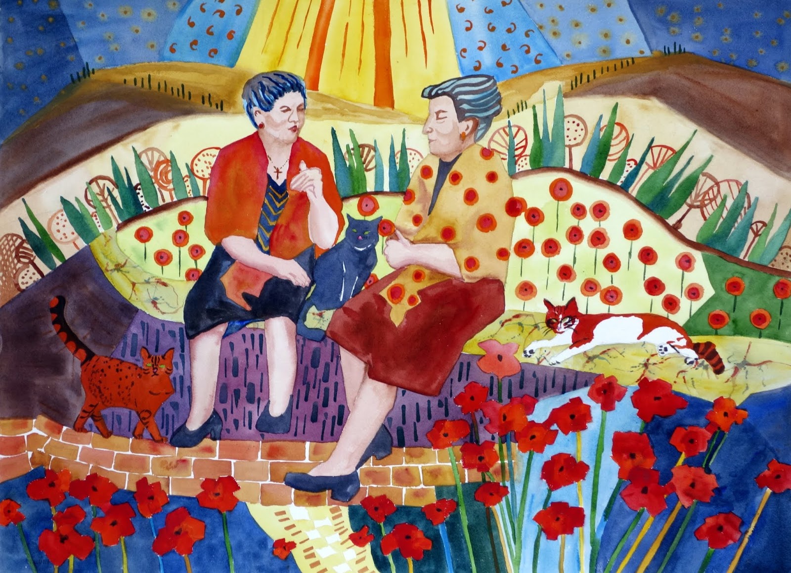
| The transparent watercolor painting as it came out of the drawer of shame |
Clearly I was in my pattern, pattern, pattern and more pattern mode. In fact, I was embarrassed by how overboard I went on this painting and stuck it in a drawer where it was never seen by anyone until a couple of weeks ago.
When I pulled it out, I saw it with new eyes. Yes, it was overly busy, but I saw a charm to it. I also felt a sadness for Italy amidst this Corona Virus emergency. How the ladies and gentlemen of Italy must miss their afternoon visits with one another!
I sent my friend, Kathy Tiger (who has often praised my pattern making), a photo of it. She immediately responded saying it had some potential if I could only get rid of some of the unnecessary patterning. Following her suggestions, I decided to get rid of the farthest hills and sky as well as the yellow pathway into the painting at the bottom.
I thought of another artist friend, LaVonne Tarbox Crone, who years ago taught me to "take it to the sink." Another artist, Mary Holt, introduced me to Ichiban tape. This tape is semi-transparent and really keeps the water from leaking into areas you want to protect. So here is the images of the taped up painting.
 |
| Taping the border, before it goes to the sink |
 |
| The painting after scrubbing the heck out of it! |
 Now the big problem was what to do with the background. Thanks to another artist, Ruth Armitage, I had learned how to use the Procreate App to try out different colors and for the background on my iPad. Using various layers, I was able to try many different colors, some with patterns, some without and settled on a neutral gray.
When I showed the Procreate image with the neutral background to my granddaughter, Angelica, she suggested that I use a circular pattern in the sky to tie it together with the rest of the painting. So I tried a couple of ideas and finally made a stamp. (Thank you, Betsy Dillard Stroud, for introducing me to making personal stamps.)
Now back in the studio, I gave a try at continuing with transparent watercolors, but as you might guess, there was too much of the color left on the paper. I had to move on to gouache, an opaque watercolor paint. I applied it with a foam roller to get a uniform effect. I then used a very subtle color change to apply with my stamp.
This is truly an homage to the Italians who are currently quarantined. It is also an appreciation of all the artists out there who teach and share their skills with the likes of me.
Now, what is the best name for this piece?


