Thursday, February 19, 2015

Where to Hang Your Art--"The Leg Bone's Connected to the Hip Bone"

There are so many opportunities out there for hanging one's art outside of galleries. As an artist, I debate over which display of my art might generate interest and sales. Also there is the issue of how much energy it will take getting the art to the location, the difficulty of hanging (I hate brick and concrete block walls) and how long the art can stay at the location.

Sold
At one time I adopted the idea that it was pointless to hang my art anywhere except where people would go to buy art--but that didn't last long.

Before the holidays I was invited to hang my art in a church for a one month display. I might have said no, except that my sister prompted the invitation, and I always enjoy a one-person show. Seeing several pieces of my art up on a well lit wall is always encouraging to me--they seem so much more powerful.

I was really pleased (and surprised) to sell one large piece from that exhibit. And further down the road, I was invited by the curator of the David Joyce Gallery at Lane Community College to hang two pieces in the current show there. She happened to attend a meeting using the church space, and liked my work enough to remember my name and contact me.

David Joyce Gallery Opening

Food Web
The curator, Susan Detroy, is also involved in hanging art in hospitals, so I may be invited to show my work there as well. "The Leg Bone's Connected to the Hip Bone."

My point is, you never really know what exposure might lead to more opportunities.

If you are an artist, what connections have surprised you? Where is the craziest place you've hung your art?

If you are an art lover, where have you seen compelling art outside of a gallery?

Before Columbus

Thursday, February 12, 2015

Creating Art is Personal

 'Every artist dips his brush in his own soul, and paints his own nature into his pictures.' — Henry Ward

Perhaps not all artists, but many of us are telling stories. I have been working on telling parts of the 
story of my younger daughter's last year getting a stem cell transplant to cure her multiple sclerosis. It is my story also, as I cared for her in the hospital, throughout the treatment, and as she recovered. 

The painting I'm featuring today is a departure from most of my work because it is acrylic, because it is totally from my imagination, and because the colors are quite neutral. The theme is hair loss, something all people going though chemotherapy experience, but it is more traumatic for young women, I think. 

I asked my daughter to come up with some words for me to incorporate into the painting.

Without Hair
30x22, Acyllic on paper

The symbolism in this piece came throughout the process, and some things I discovered after it was finished.


  • The central figure stands alone without color, except for the flower, petals and shoes (Rach loves shoes.) 
  • The small figures are colorful with plenty of hair, a symbol of what was and hope of what will be again.
  • The scissors imply that the loss of hair was by her choice. (She chose this radical treatment.)
  • The hair at the feet surprised me--they also could be sunflower petals--an unintended piece of symbolism.
  • The words (Rachel's words) frame this situation, closing it into an isolated time of her life. 
I would love to get some feedback from you, the viewer. Does the painting speak to you? 

Tuesday, February 10, 2015

One Way to Create a Transparent Deeply Colored Wash--Step by Step

Recently I've been working on being a less impatient painter. I find that certain results I want in dark colors are much more entrancing when done in transparent watercolors. Sure I can use other mediums, acrylic or gouache, but the depth and slight variation of a dark done with layers of staining transparent watercolor is hard to beat.
The finished piece from a couple of weeks ago and a close-up of the richness and variation of the background.

All paper I want saved has been protected,
and one coat of Payne's gray has been applied to the
wet surface.
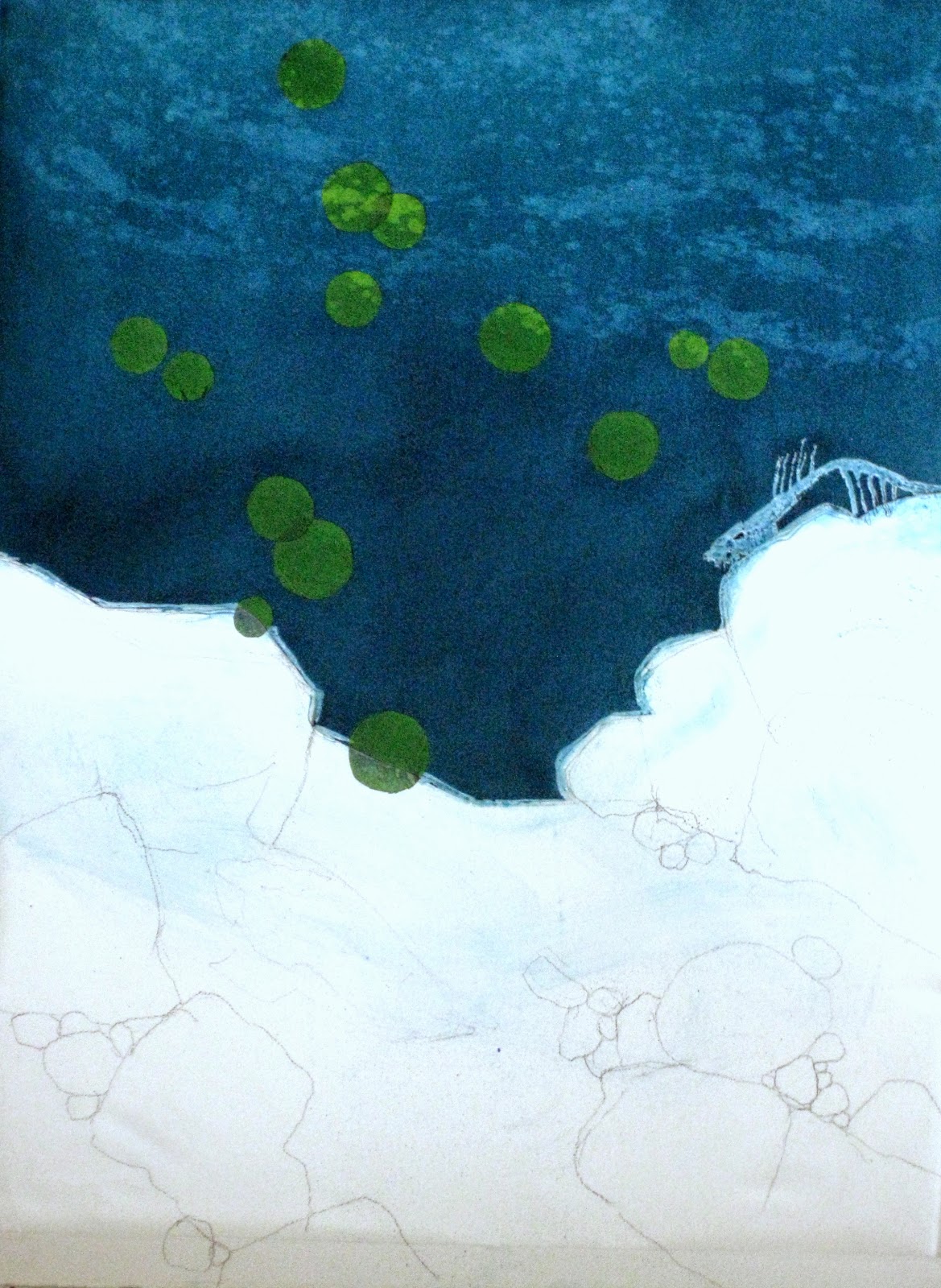
I'm sharing this as a work in progress since it is now sitting in my studio waiting for me to paint the rest of it. (Is this posting a way a avoiding the possibility of ruining this stunning water which took a week on layering?)

I'm using a method that my friend Geoff McCormack shared with me. Step one is to protect and mask off the area's you want to save as white paper which will become the subject of the painting. I've used green painter's tape, burnished down, clear contact paper for the large space and frisket (masking fluid to seal the edges of the contact paper. This is done on 300 lb. arches cold press paper.

After 3-4 coats of a mix of Windsor Green
 and phthalo blue.
First I wetted down the entire area that was to become water. I put a first wash of Payne's gray in the area I wanted to become darker. Geoff showed me how an ordinary house sponge soaked with the highly pigmented water can be put on the paper with hardly leaving any lines or smears.

Each layer has to dry completely before applying the next, so it is a time consuming process. This example is after 3 or 4 layers have been applied. The heavy paper does not ripple, but the edges do come up. You have to use a very gentle touch with the spenge and make sure your paper gets a complete soaking.


I continued this process until I had the depth of color I wanted somewhere around 6-8 layers. My very last coat was done with a good spraying of my mouth atomizer, just to make a very consistent coverage.


I wanted to have some light and create a watery feel to the upper portion of the painting. I created that movement with sprays of window cleaner onto the painting and blotting it with paper towels.

After peeling off the tape, contact paper and masking fluid, my painting is now waiting for me to create the rocks, gravel, salmon eggs floating down, the salmon skeleton and dead salmon adding nutrition to the stream for the developing eggs. It's all part of the "Life Cycle Imperative" series. 

Waiting for the rest of the story.


Monday, February 9, 2015

David Joyce Gallery Installation

If you've been in the Eugene Airport, you've seen the inspiring work of David Joyce. His photos of people flying down the hallways to the gates is fun and memorable. He is now deceased, but his art is still in the hearts of Eugene-ians and Lane Community College has a gallery named after him. I was fortunate to be asked to hang my work in the David Joyce Gallery for their upcoming Exhibit, The Tale of Two Palettes/Palates Colorful Historical Stories. 
Last Friday I spent some time helping to hang the show, which has many beautiful pieces of artwork. I learned a lot about hanging art on very long walls without using any pencil marks. I also met some wonderful artists who were also donating time to get the show installed.  
I was delighted to find my artwork featured on the invitation. Before Columbus is one of two paintings I have in the show, both with the Food Web theme. 

If you live near Eugene, I hope you find time to drop by the gallery to see the show which will be hanging until the end of Spring term. With luck, I'll see some of you at the opening reception on February 18, 4:30 to 6:30.


Sunday, February 1, 2015

With a Little Help from my Friends and More Niggling

Before            Life Cycle Imperative #6       After
30 x 22
Watercolor
After my first little bit of a love affair with LCI #6, I saw some things that were less than perfect. I consulted with 2 excellent artist friends, Kathy Tiger and LaVonne Tarbox Crone, and took their advice in 3 areas. See if you agree with the critiques and the adjustments.


  • In my excitement and enthusiasm for creating the rocks dancing in light, it was overdone. The rocks competed with the true story of this piece, which is about the salmon and the eggs. The solution was to tone down some of the rocks and soften more edges. Do you see how the rocks now enhance the salmon eggs rather than cause the eye to bounce around back and forth?
  • The eggs needed just a bit more depth in color, so a wash of a transparent yellow pigment gave them a richer orange tone that compliments the reds in the salmon, and reduces the pink.
  • The salmon in the back had a muddy tone, which I found unattractive and amateurish looking. Also the half fish on the far left had an indistinct lower body. Although it is scary to lift off paint with a sponge, when there is so much dark color to be careful of, but that is exactly what I had to do. I lifted off the muddy colors to put on a layer of a fresh pigment of the red/orange. Can you see that the murkiness has become brighter and more in keeping with the rest of the painting?
Now that these improvements have been made, I feel this is a truly finished work. And as much as I drag my heels to spend so much time on one piece, I do think this one was worth it. Lessons are learned with each painting and I am still a humble student.