One of the great things about knowing other artists is that they often can see a weakness or problem in a painting that you, the artist, can't. It can be very similar to proof-reading one's own writing.
Not too long ago, I sat in a critique group showing some older paintings and got some good suggestions for improving them. Now, after working on three of them, I'm now sending them out to you readers to look at and send more ideas. I'm even prepared for "You ruined it!"
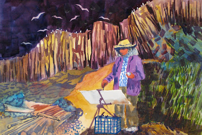
Plein Air Painter--Before
Plein Air Painter--After
The comments leading to the changes were about the ocean not working as ocean, should it be sky? I chose to darken it and then darken behind the figure to balance the piece. Another comment was that the golden path behind the figure was confusing, so I mostly got rid of it. Then I just had fun with tumbling blocks as more pattern. Maybe the new name should be Tumbling for Art.
Coastal Rhythms Before
Coastal Rhythms After
It's much harder to see the edits on this piece. I toned down the mountain the background, soften the horizon line, and rounded the junction of the shore hitting the shoreline at the land protrusion.
Remember you can click on an image to enlarge it.
The last piece I worked on today was this one of the Cummins Creek Bridge. I tried not to do any edits that would take away the power of this piece, but it had a bit of the feeling that there were two paintings here.
Cummins Creek Bridge Before
Cummins Creek Bridge After
Most of what I did in this painting was add color throughout the piece to unify and tie the right half to the left. The bridge now has some orange and the trees have some gray/blue. I hope the veiwer now sees a whole painting, not two halves trying to connect. And mostly I hope I have not weakened the impact.


No comments:
Post a Comment