Tuesday, April 16, 2013

A Stamped Start--Another Workshop Piece

 
Posted by Picasa

This may look like quite a mess, but in Mary Ann Beckwith,s workshop we learned a method of taking this start to an abstract finish. 

Step one was to stamp and texture the piece with everything from rolling paint over a garlic bag to laying down a string of beads and spraying over it. There is no right or wrong to this step. This needs to be completely dry before working on it.

Step two is choosing an abstract design. I used a method also taught by Mary Ann which involved cutting a small window (2" x 3" inch or so) out of white paper. Next we looked for a piece of interest from a magazine, or a combination of several pieces to create a small abstract to inspire the large painting. By placing clear tape over the whole piece, the combined design holds together. (Most of this small design was from an ad for a power tool.)


Posted by Picasa

The next step is to paint over the stamped piece of watercolor paper following the design created in the little window.  Surprisingly, the underpainting shows through. This process also takes the patience of letting the first layers dry and painting over the new design 2 or 3 times. Each layer adds depth and richness. And, yes, the stamping keeps coming through.

The final step is the most fun for a painter like me--adding the caligraphic marks, stamping on the top of the piece, and other mark making. See the finished painting below. I've titled it "Elephant Trunks," can you see why?

 
Posted by Picasa
Elephant Trunks, aquamedia
30 x 22 inches

Saturday, April 13, 2013

Finishing is 90% of the Painting Process

I've just returned home from the Watercolor Society of Oregon Convention which happened last weekend, followed by the WSO workshop which was this past week. Our instructor Mary Ann Beckwith made the statement that 10% of the effort put into a painting was the beginning and 90% was (or should be) put into the finishing. This was just one of the many instructive comments our instructor made during this workshop that I stored away. Mary Ann generously shared these incredibly vivid liquid watercolors she uses, which provided the wonderful colors in the kites. I had a lot of fun coming up with the concept of this piece, using kite shapes and tape to save areas of color and spraying over the top with a white paint to create the background. You can see that the white paint was just a film, letting the original color come through, making the background more interesting. Nice isn't it? However this is only the 10%.

 
Posted by Picasa

Another workshop participant and talented artist, Linda Rothchild-Ollis, looked at the piece and said, "let's take it to the next level." Mary Ann Beckwith uses more neutral layers over a piece like this to icrease focus and interest, and Linda offered to help me use Photoshop to do the same with this piece. The following morning, Linda took the picture you see above and loaded it on to her laptop. We could then play with the added layering ideas and also add some more line work. Below is the computer version.

 
Posted by Picasa

Linda next emailed me the photos which I opened with my ipad. I then could use this Photoshopped image to work on the acutal piece. I felt like some computer genius with my ipad helping me develop this piece to completion. In reality, my friend Linda did all the computer work, but I am inspired now to learn how to use Photoshop to edit paintings like this.

As you can see, the 90% of finishing started with Linda encouraging me to add the layers. I did indeed spend quite a bit of time finishing this painting after first envisioning it with the help of the computer. If you scroll up to the beginning and compare it to the finished piece below, I think you will see the difference between just a nice painting amd a really interesting and more evocative piece. At least that's how I feel about it.


Posted by Picasa

Windy Day, 20 x 26
Watercolor on Yupo

Thursday, March 28, 2013

I Like to Find Thick Envelopes in My Mail


This past week I expected to hear from two exhibitions I'd sent entries to. (An artist is given a mailing date for the notification from an art competition.) When I pull the responses out of the mailbox, I know right away whether it's an acceptance or rejection. The acceptances are thick envelopes with all the information the artist needs to frame, label and ship the painting to the exhibition. The rejections come in an envelope with a single page letting you know your painting will stay in it's drawer for awhile longer.

Expressions West 2013 at the Coos Art Museum accepted my painting "Convocation I." The juror for this event is John Hewitt and the exhibit is at the Coos Art Museum in Coos Bay, OR. I've had other work at that venue, and the museum is really lovely. 

 
Posted by Picasa

And today I received a rejection letter from the Emerald Art Center's National Show. My "Yosemite Trickster" did not make the cut. 


Posted by Picasa

Frankly, I like to get the thick envelopes!

Tuesday, March 12, 2013

Painting For a Fund Raiser

 
Posted by Picasa
Bigelow Rapid
11 x 14

I was asked to donate a painting to a local scholarship fundraiser--The Doug Dunbar Scholarship.

I decided that an interpretation of a spot on the McKenzie River would appeal to a wide audience around here and consequently raise more money. I worked from a couple of photos taken on one of Mike and my little summer afternoon raft trips.

Because of the art path I've been travelling, it's a challenge to just paint something that "is." However, it turns out I can go back to my roots in transparent watercolor (with a touch of gouache) and paint a pretty landscape.

Thursday, March 7, 2013

Orange Juice or More Lemons? You Be the Judge

You are no doubt familiar with the old saying "If life hands you a bunch of lemons, make lemonade." My 11 year-old recently shared a slightly different version,"If life hands you a bunch of lemons, make orange juice and let people wonder how you did it." So today's blog and art is inspired by that new version.

In November I was messing around with surface texture using rice paper applied with gesso and thick gesso which was scraped around with my toothed credit card. On top of that I used acrylics, watercolors, inks, watercolor pencil, etc. In the end, I had a failed painting, in the sense that it was not pleasing to the eye. On the other hand, I learned a heck of a lot.

 
Posted by Picasa

I pulled it out of my flat files the other day, and decided to continue my experimenting. I'm not sure how the idea came to me, but I decided to cover all but two somewhat nice water areas with rice paper. This created a couple of windows into the river scene.

 
Posted by Picasa

Once this simple act was done, I started seeing ways to respond to what was left. I first painted the rice paper with a gold/orange and looked at that for a few days. I could see that I needed to connect the two windows which I did by applying a larger square shaped line on the rice paper part with molding paste. I painted that with just a slightly darker gold orange making the connection. And then I was off on an adventure. I stamped, applied self-colored tissue and rice papers. I created a cruciform (cross-shaped) design. I moved white water across the paper horizontally with white ink and acrylic paint. Mostly I just had fun following my instincts and trusting my eye to see how to weave this all together. And "weave" is the thought that brought me the title well before it was done.

"River Tapestry," really mixed media, 15 x 21 inches. Orange Juice or More Lemons? You Be the Judge.

 
Posted by Picasa

Saturday, March 2, 2013

How to Mount a Painting to a Cradle--Step by Step

A Cradle? We aren't talking infant beds here. This is the term used for a painting panel which can be used in several ways. I was looking for a way to present my artwork that would eliminate the mat, frame and glass or plexi-glass which is the traditional way to hang a watercolor painting. A friend attended a workshop held in Portland, taught by Rene Eisenbart, and he shared what he learned in her workshop.

First step was getting the necessary supplies. I looked on line at americaneasel.com and found they did not list the size cradle I wanted (one that would fit a 1/2 sheet of watercolor paper.) I called them and found the price very reasonable to have a custom made size, so I ordered 3. 

I also had to order a variety of Golden products to mount and protect the painting. I will tell you what I used as I go through the process.

First I coated the top of the wood panel where the painting would be attached with 2 coats of GAC 100. This product prevents acids from the wood making contact with the paper. In this photo I have already coated the top and have taped it off to apply stain to the side of the cradle. When I coated the top, I taped the edges to keep the GAC 100 from making contact with the wood so the wood would take the stain evenly. 

 
Posted by Picasa

Next I scrounged around in my garage to find sandpaper, stain, and varathanes to finish the sides of the cradle. (Thank goodness I've got an assortment of such stuff from years of home projects.) The wood in the cradle is quite nice wood and can be painted or stained. For my painting, I thought a stained wood would be quite handsome.

I sanded and stained the sides and bottom edge of the wood. Be sure to read the directions on your particular products. This oil based stain needed a few hours to cure.


Posted by Picasa

After the stain cured, I sanded with a fine sandpaper and applied clear varathane to the wood. I recommend using a water based product for several reasons--fast drying, easy cleanup and less smell. I put on 2 coats of clear and one final coat of satin varathane, sanding between each coat. I now had a well prepared cradle for my painting.

 
Posted by Picasa

I prepared my painting by applying 2 or 3 coats of Archival Varnish MSA with UVLS. Now both my board and painting were protected from damage as I moved on the the big event--gluing the painting on to the board.

 
Posted by Picasa

The product for this step is Soft Gel (gloss). I simply applied a good layer of the gel to the back of my painting. Again, I protected the sides of the cradle with painters tape.  I used my brayer roller to apply pressure and firmly attach the paper to the board, getting all the air out.

*When I do this again, I will wet the back of the painting with water so the gel is absorbed more evenly. I ended up with a couple of bubbles, which I'll explain how to remedy at the end of the post.

 
Posted by Picasa

I then put freezer paper over the painting, put it all under a piece of plexiglass on top and hoisted my two 25 pounders on top of the plexi and let it adhere overnight.

 
Posted by Picasa

You want a small overhang where the painting is a bit larger than the board it is being mounted on. I used a utility knife to make a clean cut where the painting met the side. I had a sliver of white paper at the top, where it had been cut, so I used my finger in a bit of gouache to stain the white, and since both the painting and wood were protected with a finish, I just wiped it all up with a paper towel. The final step was using Top Coat with UVLS to put a final finish on the painting and I was careful to wrap the finish over the edge again to protect the little sliver of exposed paper I had just stained with gouach.

 
Posted by Picasa

The one problem I had was the bubble in the middle of the painting after the application, weighting down and all. I did fix it--a trick I learned from years of hanging wall paper. I took my exacto knife and slit the paper along an area I knew a small cut would not show. Then I inserted enough soft gel to adhere the bubble to the board, making sure to massage it into the farthest parts. It is invisible now. But I do think starting with a moist paper prior to applying the soft gel would be a good idea.

I am really pleased with this presentation. It lends itself well to a more contemporary painting like Columbia Basin Reflections. It takes quite a bit of effort, but the piece is now secure and protected. I won't have to worry about glass breaking, plexi scratching, etc. I have two unfinished cradles sitting in my studio. I haven't chosen my next painting to mount using this method, but I like this new and refreshing way to hang art.

 
Posted by Picasa

Columbia Basin Reflections, Mixed Media, 14.5 x 21.5 inches

 
Posted by Picasa

Tuesday, February 26, 2013

Yosemite Trickster- Step by Step

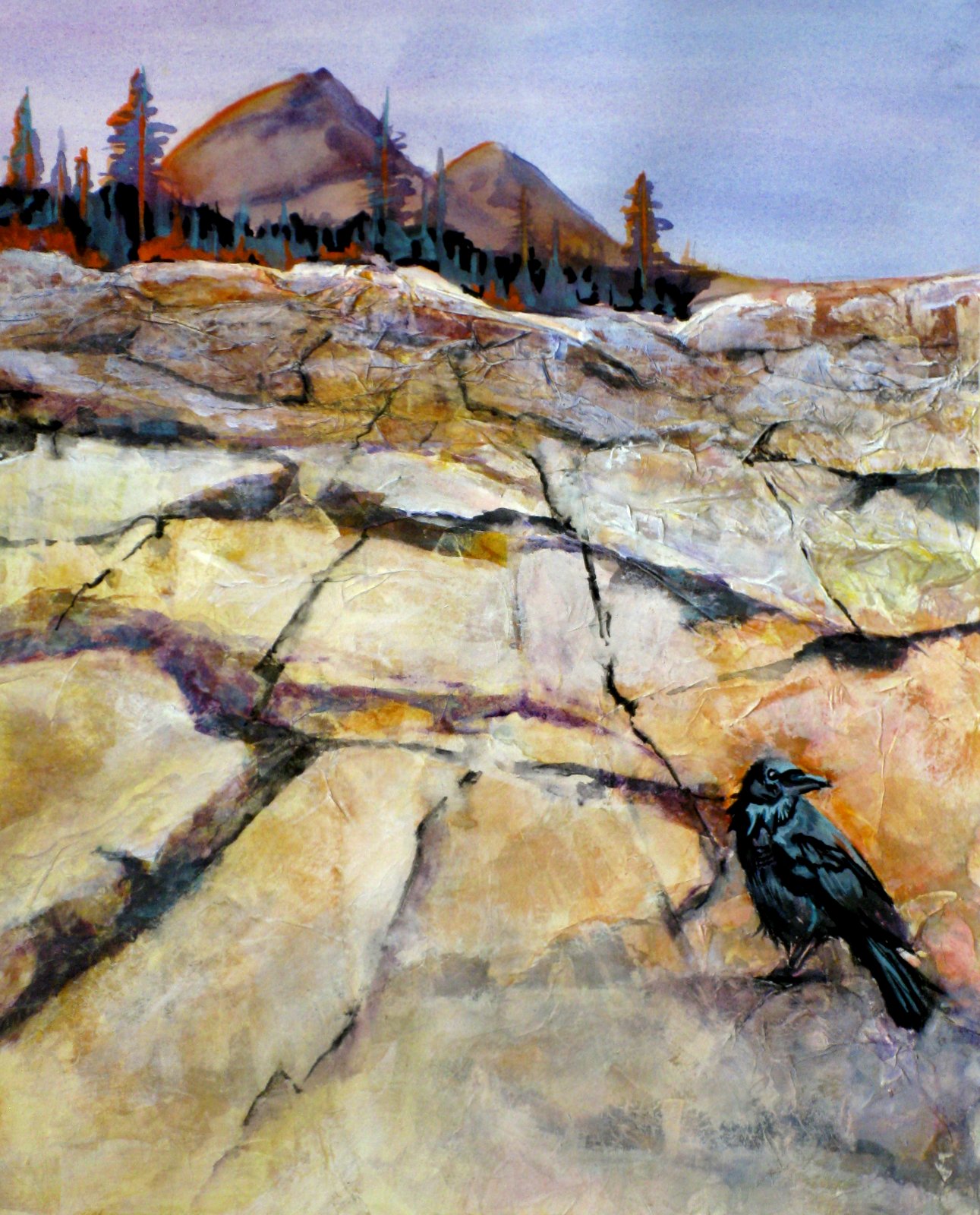
Ever since visiting Yosemite National Park this past fall, I've had this image in my mind. I wanted to paint a picture to convey the fabulous slabs of granite that lay in slopes reaching miles toward the wonderful domes of Yosemite Valley. I also wanted to include a raven. We saw so many, and I enjoy painting a representational critter into a fairly abstracted landscape.

 
Posted by Picasa

After a rough drawing, my first step is applying natural colored rice paper to the lower 3/4 of the paper. I take a putty knife and apply white gesso to the watercolor paper, then put down pieces of rice paper, smoothing the edges down with more gesso on my tool. For this piece I wanted to represent smooth slabs as the painting comes toward the view, so those pieces are large pieces of rice paper. The upper portion, however, I wanted to imply much smaller bits of rock to give the illusion of distance. For that effect, I wrinkle up the rice paper as I apply it.

 
Posted by Picasa

One of the reasons I like this technique is that transparent watercolor is absorbed in such an interesting way. 
The gesso resists the color, while the rice paper absorbs and spreads it. It gives a look I can't get any other way.

So my next step is putting down some background color. The day I want to show is warm and sunny, so that guides my color choices--yellow, gold and orange. I place more orange at the upper left and lower right where my "Trickster" will sit.

 
Posted by Picasa

I continue to add darker colors to the rocky ledge going away from the viewer. Later I can lift, or use gouache to lighten my foreground. A lot of this color is sitting on top of gesso which is easily removed.

 
Posted by Picasa

Now is the time to lighten the rocks closer to the viewer, break up the rocks in front in slab-like sections. A purplish brown application of lines in uneven application makes the crevices, and lifting and a lightly tinted gouache lightens the areas at the bottom of the painting. Yay, I'm almost done!

 
Posted by Picasa

Finishing "Yosemite Trickster" is a matter of painting in trees and shadows on the mountains. I use orange and a subtle blue to reflect the colors I have on and around the raven. I use lines to draw the eyes back, giving the feel of looking into the distance. I also cooled down the mountains with a couple of blue/purple washes. It is a matter of a bit here and there--step back-- a bit of color here to connect the parts of the painting--step back-- reduce this crevice--step back. I continue this dance in my studio until I see nothing that draws my eye to a bothersome point, rather than letting me enjoy the piece as a whole.

 
Posted by Picasa

Yosemite Trickster. mixed media, 22 x 18 inches

Let me know if you appreciate reading about my process.