Tuesday, May 24, 2016

Women: My Current Topic for Paintings

After finishing my painting, "She's Allowed," I had an idea or inspiration land in my brain. I could create a painting about women that are not "allowed." And I loved my child image so much, and felt she had so much impact that she could be included with the question, "Will She Be Allowed?"

In these pieces the women are anonymous. Painting the clothing as one, and having suggestions of faces with no personality are all part of this exploration.

I am also enjoying flattening my painting, showing very little dimension which gives a painting a contemporary feel that I like.

In "She's Allowed," the shapes and lines are static. I've had fellow artists comment that it is perhaps lacking in design or could be more dynamic. As a response, I have adjusted the newer painting to have more broken up shapes. Does it make for a stronger painting? You be the judge as I take you through my process of creating "Will She Be Allowed?"

I love adding very individual components to my work. That often includes stamps that I make for a particular painting: hieroglyphics for paintings about Egypt or petroglyphs for river paintings. For this painting I chose Afghanistan as my backdrop. I have not been there, but I have been in other parts of the world where women wear burkas, minarets pop up in the landscape and sand covers the earth.

The stamp for this piece began as a web translation search. I wanted to use Arabic letters, but more than that, words. I do not put these down to be read, necessarily. For one thing, I am merely copying shapes, and they are probably not very well done for any Arabic reader. I use these as much for myself to remember the essence of my connection with the message I am working with. The English words I chose to translate were "women" and "Will she be allowed."

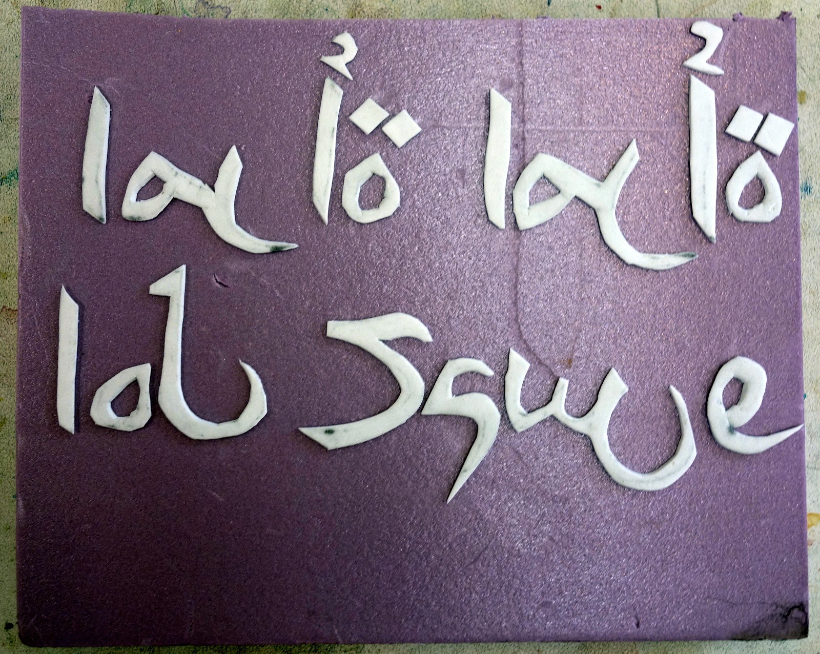

Oops! The first one is not going to work because I need a mirror image! You'd think I'd learn, but in my excitement to do something, I sometimes make twice the work! These are made with craft foam on blocks of interior insulation.


Next, I made collage paper by putting a blue/black gesso on newspaper, then stamping on it with acyrilic paints after it dried.


After all this preparation I was ready to draw and start the painting. The way I get the consistently flat look to the garments is with a number of high pigment washes put on with a sponge. A final step is with a mouth atomizer.


Everything I did not want dark blue is covered with masking fluid or clear contact paper.


My next step was to put color on the faces and background with watercolor and put on my first stamping, then covering with an acrylic veil.


Adding my collage papers was great fun. I had made so many pieces with various blues, that I had a lot of choices. My child got her costuming from more web research into clothing you can buy for children in Afghanistan.

The finishing touches:

  • Adjusting the colors on the minarets
  • Adding darks to and breaking up the sand with more stamping
  • Putting eyes on the women with hints of mesh over the open area

Will She Be Allowed
Mixed Media, 29 x 22 inches


Comments Welcome!


Wednesday, May 4, 2016

Egypt Painting

Content and symbolism are components I work hard to put into my paintings. This is making me more aware of the process I use for creating a painting. This recent Egypt-inspired piece is a good example. Here is list the list of influences, thoughts, and sources that proceeded and were gathered while working on this painting.

  • A trip to Egypt last April--think hot
  • Several photos from that trip: columns, hieroglyphics, temples, me coming out of a tomb
  • A stamp of hieroglyphics I made for an earlier painting
  • Ideas for making the walls look ancient
  • Two small paintings (one of a figure, another of columns) I did in a Ratindra Das workshop in October
What I do over a period of time is gather source materials and envision what I want I want to say in a painting. The content and ideas I hope to communicate in this painting are: heat, the amazing architecture and art, ancient Egyptian communication, contrast of modern with old, and the transitory nature of being a tourist. All of these pieces are part of telling "my story" and my own experience of visiting this ancient culture.

To develop the aged walls, I used the following technique. After sketching in my composition, I tore up small pieces of paper towel, drenched them in watercolor pigment, applied them to my watercolor paper and let them sit for awhile. I was careful to remove them while still damp so they wouldn't stick to the watercolor paper.


I decided on a red sky and a dominance of warm colors for the painting to imply the heat of the Egyptian desert and to reflect the actual colors of the landscape. The painting began coming together as I used hieroglyphic symbols on the background building and left pillar shapes to be worked on later.


It was only after the painting was finished that I saw the connection of the small figure in the relief and the modern figure coming out of the tomb.


Once I got the painting to this point, it stayed like this for quite awhile. I was so in love with the figure being so 'Milton Avery-esque." After getting personal critique from Jeanie McGuire, emphasizing the importance of a paintings unity (how a painting must look like it was all painted by the same artist) that I let go of the white hat and coat.  I did a minimalist job of painting the suggestion of a face and a few clothing details.

I'd love to hear your comments on this painting and how well it communicates and resonates with you, the viewer.


Sunday, May 1, 2016

How Much Can I Fit Into One Crazy Week?


   The week started with a 2-day workshop in Brownsville, Oregon. The class participants  made unique stamps and collage papers. They then applied these new skills to their art work. A lot of good starts and ideas came out of the workshop.
Click for Options

There were creative forces swirling around the Brownsville Art Center!


After the workshop, I headed north with my husband to meet our younger daughter in Seattle. She had flown up from Arizona for her 2-year medical evaluationWe spent two days meeting with the medical staff working on this phase 2 study. Rachel had received a rather drastic and experimental treatment for her MS two years ago. This yearly check-up showed no disease activity at all. She is apparently cured, an unheard of thing with MS until a few years ago. Can you see the joy in the faces of Rach, docs and staff?


Our plans were to stay in the area until Thursday to attend the Northwest Watercolor Society reception for the International Exhibition. While traveling, I got the word that my painting was to receive an award! To celebrate and unwind, we spent a couple of days in Port Townsend.

Then it was back to Seattle where I was delighted that my painting, "Enduring the Cure," had won 5th place! I am so honored to have gotten an award among such strong paintings.
Getting a personal critique from the juror,
Jeanie McGuire.


After the crazy, full and amazing week, Mike and I finally put Rachel on the plane at Sea-Tac sending her back to her home and family in AZ.  We then stopped by Camas, WA to see our older daughter, Meg at the rock yard she manages. Then back to Blue River.


The last two days I've been unpacking, doing laundry, and unpacking my art supplies. New paintings are floating around in my mind. Stay tuned!

Thursday, April 21, 2016

"I See You" Step by Step

Communion
29 x 22
Mixed Media
Earlier this month I posted a painting of a woman lying under a starry sky. Although I really like this painting--the idea, the feeling of being mesmerized by the night sky, I wanted to improve the design elements.

I visited with an art friend, Geoff McCormack, who is not only a great artist, but also a computer whiz. He put together a few images to help me figure out a less static figure and a way to make the painting less divided into half.

I took photos throughout the process of creating the second painting, so I can share my process with you.


Steps 1 and 2: First I determined the curve of the earth and blocked that edge off with tape. You can not see my drawing well in this photo, but the figure has one foot above the horizon line, so I have used masking fluid to protect that and all the stars.

Next came many layers of a blue mixture (transparent watercolors) applied with a sponge to get the depth of color I wanted. After those layers were done, I added one last layer applied with a mouth atomizer to make the blue as consistent as possible.


Step 3: After removing the tape and masking fluid from the stars, I outlined the figure with masking fluid to protect the edges from the texturing of the earth.


Step 4: I took a thin rice paper and applied it with white gesso to the earth area. I ripped up fairly small pieces and crumpled them as I applied them.


Step 5: While the rice paper/gesso was drying, I worked on the sky. I colored some of the stars and added the constellation Cassiopeia. By creating a figure in the sky the painting shows a deeper connection between the human and the universe.

I was perplexed about painting the constellation without a drawing (graphite doesn't show up on deep blue paint). It came to me that I could draw it with a white chalk pencil, then go over it with white ink.

The Milky Way was added by spraying gouache with a toothbrush.


Step 6: I started painting earth with transparent watercolors. The first layers of color really show off the roughness the gesso and rice paper can create. Of course, it was too much contrast with the sky, so I moved on to painting layers with acrylic paints to unify the texturing.
Step 7:  Because I am most comfortable painting with transparent watercolor, I moved back to my W/C palette to paint the figure. As that moved along, I starting thinking about what color to paint the nightgown. A color that was harmonious with the sky would connect her more to that, a gold would connect her more to the earth. Decision time!
Steps 8: Now on to the finishing touches. The sky figure got a second outline of a turquoise chalk, because the pure white ink did not have enough impact. The figure ended up with a split colored gown (thank you, Ruth Armitage). She is not stuck to the earth, nor is she floating up to the sky. She is connected to both. The earth's edges got darkened with the gowns lavender color, enhancing the curvilinear line and breaking up the shape a bit.

Is it done? I'm thinking of adding some more sprayed stars on the right of the sky, but I'll sit on that idea for awhile.

I See You
29" by 22"
Mixed Media

Friday, April 15, 2016

Priming the Pump

My followers know that I was on a trip to SE Asia not long ago. Traveling to another part of the world filled my eyes, brain and emotions with many images and ideas. In a way, being over-saturated with images and ideas can make it hard to sort out what I might paint and how I want to express it on paper.

"Priming the pump" this past week meant doing some small, crisp, and realistic paintings. I started with one drawing which I thought I would incorporating into a large piece. When I finished the drawing, I fell in love with the simplicity and lines. I decided to let it become a work on paper using pen and ink and acrylic paint. I was so happy with that first piece, that I chose two more images to treat in a similar fashion.

Here are the first three 8 1/2" x 8 1/2" paintings. I have matted them with a light grey mat with black liner, which gives the colors a chance to "pop." The final simple black framed piece  is 14 1/2" x 14 1/2."

Vietnam: Laundry Day


Vietnam: Woman Sculling on the Mekong Delta


Vietnam: Old Friends in the Garden

Tuesday, April 12, 2016

Fine Art vs Decorative Art

fine art
noun
  1. 1.
    creative art, especially visual art, whose products are to be appreciated primarily or solely for their imaginative, aesthetic, or intellectual content.
    "the convergence of popular culture and fine art"
  2. 2.
    an activity requiring great skill or accomplishment.
    "he'll have to learn the fine art of persuasion"
decorative arts
noun
  1. the arts concerned with the production of high-quality objects that are both useful and beautiful.


Many years ago, in the beginning of my art journey, a world renowned instructor told me that a painting I had created in his workshop was a nice "decorative" piece. Being a self-educated artist, I had a pejorative idea of what that meant My interpretation was that it was cute, sweet, something you'd hang in the bathroom. It was not the thing I was striving for.  And I did not have the guts to just come out and ask what he meant. 

Over the years I have learned that it was not a condescending remark. I have attempted to get a better grasp of the meaning and difference (if there is any) between "fine" and "decorative" arts.

When I google famous artists considered "decorative" artists, the names of Klimpt, Matisse, and Tiffany come up. Many items considered decorative art are both utilitarian and beautiful. (I guess a painting could cover up a hole in the wall, making it utilitarian!) Decorative art is often associated with the Art Nouveau and Art Deco movements. "Artists drew inspiration form both organic and geometric forms, evolving elegant designs that united flowing, natural forms with the more angular contours." As always, art was moving in a different direction, letting go of some of the more traditional ideas of art--making room for modernism. 

In any case, I now feel fine creating art that is more decorative. Who wouldn't want to be in the same category as Klimpt and Matisse?

Most of my studio time is spent doing what I would call fine art. I am going for that "imaginative, aesthetic, or intellectual content." I have an idea or story I am trying to incorporate into my paintings. I am typically more content oriented. This is the more cerebral me. 

Other days I am just happy to create something more spontaneous and decorative. The two pieces posted here were done on previously marbled paper. Being springtime, I felt compelled to create flowers and used collage materials made with deli paper and gelli plate. 

Tuesday, April 5, 2016

Telling My Story in Art: Titles

My friend Ruth Armitage recently created a post "My Art Means Something." Among other things she talks about choosing a title for a piece. I often wrestle about finding the right title for a painting myself.  As Ruth states, "I feel that the meaning of a painting can be one thing to the artist, and something different to the viewer." Although my work is not abstract like Ruth's, I do debate about how much information I give my viewer with a title, because I want them to connect to the painting. I want the art to bring up their own memory or spark something in their imagination.

This painting was one I struggled with trying to find the right title. Although the memory that inspired this was about being lost in a department store, looking for my mother, it really uncovered and suggested so many deeper and important ideas. I do not want to have the title limit what the viewer might feel or conceptualize.

She's Allowed
28" x 21"

The title that has struck the right chord for me is "She's Allowed." It doesn't really matter what this child is doing, she is just a child who is allowed to be herself! Thanks to my art friend, Sandra Neary and Elizabeth Gilbert via her book on creativity,  "Big Magic," I have come up with a title that allows the viewer to make up their own story about this painting. Please wander in and think about a time when you were a child and what memory this brings up for you. You are ALLOWED!

So now I am looking for a title for my recent painting capturing a memory from this last summer. I could tell you the story of laying out under the stars on the Rogue River, but I'd rather you think of a time you connected to the Universe via the night sky. Do you have a title for me?