Monday, September 16, 2013

Why Go to Critique Groups? Before and After

There is a conflict for me regarding getting other artist's opinion on a piece of art. On some days I feel that I should be able to look at my own paintings and make my own decisions regarding my own art. But I have learned over time, that, as the creator of a painting, I can be blind to a problematic part of a painting. A new set of eyes can see something that allows me an opportunity to improve a painting.

So thank you to my art friends who speak up at a critique and lead my eye to something in a painting that is a bit off.

Such is the case in the painting featured today: Catch, No Release.

Catch, No Release, Before
Catch, No Release, After


The obvious change is the dark strata above the heron, which enhances the upper wing of the bird, and makes a bolder statement. Thanks Ruth!

The other major change taught me something really important. Even in a piece like this, that is mostly abstract, the realistic part needs to me exactly that, realistic. A critique group pointed out that the legs disappearing behind the pile of rock was confusing. and worse than being confusing, the heron appeared to be at a different place in the water from the fish he had just caught.

When using mixed media, certain things cannot be changed. The collage pieces could not be removed easily, leaving nice paper underneath. But I could lift the paint creating the heron's legs and position him further out in the water. What a difference!

With a few more color additions, reds to create a bit of a strata separating the two dark stratas, and adding more color to the collage pieces to help them "pop," I think this piece is finished.

Catch, No Release, 22 x 17, Aquamedia
And THAT'S why I go to critique groups! My art friends teach me to be a better artist.

Thursday, September 12, 2013

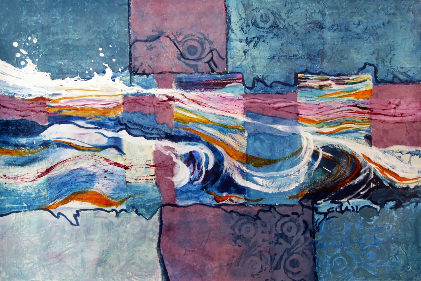
Transforming a Piece of Paper--River Tapestry #2, Step by Step

Every artist has them--paintings that just don't work. But the challenge and joy can be in transforming a painting like this into something creative and vastly more interesting.

Although I really liked the idea of the water painting (so much so that I did two of them), the results were not to my liking. I didn't toss these two paintings, but put them in a drawer. Occasionally I would pull them out and take a look, eventually seeing beautiful parts that led me to transform them into my new series, River Tapestry.


The first step was locating and isolating the parts of the water that I thought were beautiful. I then glued rice paper on to the painting leaving windows of the river painting. I painted the rice paper with acrylic paint.


Step two was choosing some more rice paper, this time pieces that I had painted previously, to collage on the new surface. This determined the accent color as well as the division of the rectangular shape of the paper


After adding both mauve and blue rice paper pieces, I used one of my stamps to put patterns on the piece. This is the beginning of the "tapestry."

Once the painting was at this point, the challenge was to incorporate all the elements into a flowing piece. I wanted to enhance the water flow across the painting, and create color harmony. I adjusted colors, neutralizing the blue with a grayer color. I added more orange in the water as a lovely contrast to the blues. I began to "weave" all the parts together. All of this part is just an intuitive process. I would do something to the piece, prop it up and step back. This way I would see a problem and solve it. Then another problem would draw my eye and I would resolve that. 


The final work was applying small lines using ink, colored pencils, acrylic paints applied with a small brush. My final step was adding the ghost-like figures of a heron and three fish, a very personal touch!


River Tapestry #2
Aquamedia 15 x 21


Sunday, September 1, 2013

Taking Time to Finishing a Piece

Over two years ago I painted Sing Me the Legends. I loved both the creation of this piece and the meaning it holds for me. It carries a personal message and has a lot of emotional content, which may or may not come across to the viewer.

Sing Me the Legends, Before
However, I have entered it in a number of competitions, yet it has never been accepted. This last spring, at a WSO conference, Juror Mary Ann Beckwith critiqued Sing Me the Legends. She gave me encouragement--she found it interesting with beautiful passages, but questioned why I hadn't finished the left edge of the painting. At first I didn't understand what she meant. I thought I had finished the edge and loved the painting so much I was reluctant to change it.

This weekend I returned home after two weeks away and became fearless in the studio. First I took Sing Me the Legends out of the drawer and looked at it with a fresh eye. I could see that the pale left edge lacked the same colorful and dramatic approach of the rest of the piece. As Mary Ann said, the edge needed to be finished.

Sing Me the Legends, After


Now when I look at this piece, my eye is carried into the white water in the upper area and around the rocks, which is really where the action is. Also, the petrogylph pieces coming down on the left sided are much more settled into the piece. All in all, the changes have made this pai so much stronger.

While I was on a roll, I took another piece out of the drawer, River Tapestry #1. I had liked the start and the concept, but knew it needed the finishing details to make it make sense to the viewer. (If you are interested in the start to finish of this painting, see a previous post Orange Juice or More Lemons? You Be the Judge

River Tapestry #1 Before
My idea had been to create a strong connection between the water theme and the fabric quality surrounding it, living up to the title, River Tapestry #1. When I placed this unfinished piece in my file cabinet, I knew it was a ways from finished, but it wasn't clear to me how to finish it. 

I went to work making the water flow through the piece, emphasizing the currents and white water. I added threads that I saw as remnants of the weaving of the tapestry. I reworked some of the colors to ensure the painting felt balanced.


River Tapestry #1 After
With the finishing touches, I have become quite enamored with this painting. I am preparing to mount it on a cradle, rather that a traditional mat and frame, giving it a contemporary presentation.

Do you see the improvement?

Do you connect with either of the paintings featured today? Comments are always welcome.

I am currently finishing River Tapestry #2--yet another blog post topic. 

Friday, August 30, 2013

Painting Accepted: Blue Moon Heron II


Blue Moon Heron II
23 x 18
Transparent Watercolor

This painting was accepted into the Watercolor Society of Oregon's Fall Show by juror, Linda Doll. It will hang among 80 other paintings in Bandon, Oregon at the Southern Coos Hospital October 4 through December. I am very happy that my painting was selected and will be hanging at the convention where I will hand over the gavel to a new president of the WSO. 

Viewers may recognize this piece as being very similar to a previous painting, Blue Moon Heron, which was not a transparent watercolor painting, therefore ineligible for exhibitions which require a picture painted only using transparent paints. For non-painters, this is confusing, I know. There is a certain quality to a strictly transparent watercolor painting, that is both challenging to the painter and lovely on a piece of watercolor paper. Where other paints cover up the paper, transparent watercolors soak into the paper, leaving a jewel-like characteristic to the colors.

I hope many of you will see this and other paintings in person in Bandon. The Oregon Coast is a wonderful destination for a fall vacation.

Thursday, August 15, 2013

Catch, No Release--a New Painting

A few months ago, perhaps as far back as January, I started this piece. Until a week or so ago, it sat waiting--a drawing with two strata of rice paper, one at the bottom, and one above the heron's wing. I chose this start after my struggle to finish two transparent watercolor pieces a couple of weeks ago. Why this one when I have a stack of painting starts in a drawer? I took this one to my table because I was confident about how I would complete it. That sure makes the studio time less stressful.


Borrowing ideas from previous paintings, I worked on the basic strata first, before beginning the detail of the Great Blue himself. 


At this stage of the painting, most of the paint has been applied, but it is waiting for the detail that will make a statement. The details will tell a viewer that it is one of mine, that it is an interpretation of what I see and feel on the river, that it is something I am passionate about.


Catch, No Release
22 x 17
Aquamedia


As always, comments and critiques are welcome.


Sunday, August 4, 2013

Continuing an Idea--What Eats What


Following along a food web theme, I just completed a new painting. This time I have included a second heron, and simplified the rocks, water and animals. I used my petroglyph stamps to create a depth to the background cliff. I like giving a nod to us humans, but use petroglyphs to symbolize humans. The animals are where the action is, for sure.


What Eats What
22 x 30

Here are two previous paintings along this theme. I'd love to get comments regarding the theme and opinions on the three paintings.


Food Web 
15 x 30


Food Chain
30 x 15 
SOLD

Thursday, August 1, 2013

Developing a Concept--Step by Step

Success is dangerous. One begins to copy oneself, and to copy 
oneself is more dangerous than to copy others. It leads to sterility. Pablo Picasso

I've been asked where I get my ideas for paintings. This one came to me while on our last raft trip. I kept seeing a stylized heron against a broken up spiral shape. I finally pulled a sketch book out of my dry bag and started a sketch. I tried out some ideas that would put it into a strata painting, which I've used a few times in my River Series.

This image stayed with me until I got home and out to my studio. As I began to map out the concept on a full sheet of watercolor paper, I made adjustments to my original idea. One heron became three, the fish moved to the bottom of the paper and the rings disappeared. As with so many of my paintings, the art develops on the paper. 

I wanted to create organic lines as I divided up the strata areas. Painting a truly random looking line is nearly impossible, so I started thinking of ways I might create a line without painting it. I ended up tearing a paper towel into strips to lay down (I taped the strip to keep it from moving) next to the edge of the first layer, letting the paint wick into the area.


I covered my spiral shape and the 3 heron bodies with contact paper. I anticipated imperfect edges and decided to deal with those once I'd gotten my washes on the paper.

After seeing my first wash and thinking about the imperfect edges I knew I was creating, I used my mouth atomizer to spray over the section and add splatters. I was creating more spontaneity in the piece.


The organic edge left by torn paper towel.


You can see the interesting edge that was revealed when I pulled off the tape and torn paper towel. I love the 3D effect it creates as well as the randomness of the edge.

My next step was to nail down a way to abstract pine branches for my upper panel of the strata. I practiced on a small scrap using torn paper towel circles to create an imperfect circular shape, then used line work to imply pine needles.

As I created the top layer, I decided to let go of the branches that I'd painted into my practice piece, leaving the images more imaginative and abstract. I don't have to explain my own symbolism, do I?

As I began the bottom layer, I chose to use the same circular torn paper towel pieces to create rocks under my fish. I used contact paper to protect my fish shapes as I worked on this panel. I liked sending the fish off in the opposite direction of the herons. I liked having a circular repetition in each panel, yet having very different organization of the shapes. The top is random, the middle is background, and the bottom is organized in a row.

As my focus switched to the main part of the painting, I began to embrace the idea of using the imperfections of the herons and spiral. I slowly enhanced those parts and used them to create interesting parts on each heron.

As each heron developed, I wanted to allow them to vary from somewhat developed to entirely detailed.

It was at this point that I sent my painting out to some artist friends. Their critiques led me to finishing the painting with much more impact and interesting details.

In finishing this piece, I added a dark background behind the herons to enhance their importance and create drama. I then used an exacto knife to scrape white into the legs and make the splashing water beneath the herons.
Becoming
Transparent Watercolor
30 x 22